Picture yourself sitting at a table in a five-star restaurant. You learned about this place by reading the rave reviews and so far everything has exceeded your expectations. The atmosphere and decor are carefully thought out, right down to the table settings.
A friendly and attentive waiter serves you with a smile, filling your water before you ask, happily taking you through the menu options and patiently answering any questions. You get your meal quickly and it’s exactly as described.
You’re definitely going to recommend this place to your friends. Basically, you just had a great user experience (UX). Websites aren’t restaurants, but consider what happens when you think of a website in those terms.
When a website has a great UX with maxed-out conversion rate optimization (CRO), it’s like a restaurant with top-notch service. A helpful waiter is akin to a useful website navigation — enabling users to easily find the information they seek.
And a great atmosphere and decor is like a well designed user interface (UI) that’’s visually appealing and cohesive, providing clear calls to action with a clean visual hierarchy. Just like the restaurant’s going to do well, a great website — with super UX that has been thoughtfully optimized for conversion — can boost your business success and set you apart.
It’s not just luck that makes for a great restaurant. It’s knowing what pitfalls to avoid. The same goes for a website. When it comes to UX and CRO, here’s what you need to know:
What Are UX and CRO? A Quick Overview
Both are huge factors in a website’s success, but they’re not always understood.
User Experience (UX) encompasses all aspects of an end-user's interaction with a company, including their products and services, as well as the navigation, loading speed, and design of the company’s website.
Conversion Rate Optimization (CRO) refers to a systemic process of optimizing a website's design and increasing the percentage of browsing visitors that ‘convert’ or take a desired action, such as making a purchase or filling out a form. This is a revenue driving activity that can grow the business without investing additional acquisition resources.
How to Improve Website Navigation for Better UX
Visitors browsing your site should be able to navigate with ease. But poorly designed navigation can confuse and frustrate your audience, driving them to leave. Here’s how to make sure your website's navigation has everything the user needs without detracting from the user experience:
1. Simplify Navigation Menus for Clarity
Have the right information readily accessible without adding too many options. Cluttered navigation can be distracting, making it hard for the user to find what they are looking for. If your website has a lot of content, consider using dropdowns in your main navigation to keep everything organized.
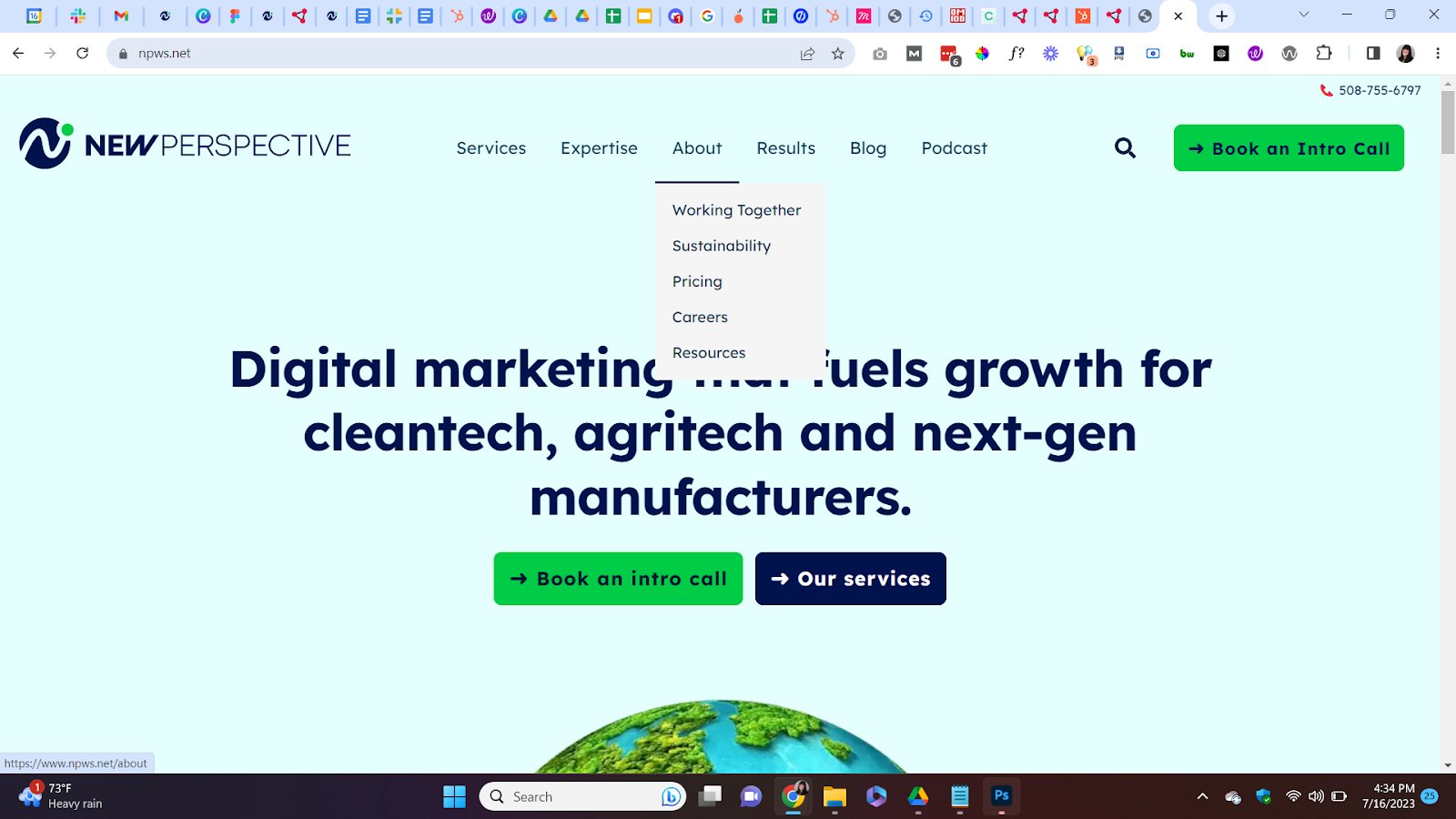
2. Use Clear Labels and Hierarchy
Your site’s navigation should have clear, concise labels so the user knows what to expect when they visit a page. Place the primary navigation menu on the same location for every page (typically at the top). All of your website navigation menus should be styled and function consistently.
3. Ensure Navigation is Responsive and ADA-Compliant
Make sure your website’s navigation works well on a desktop but adapts well to smaller screens like tablet and mobile. Keep the content accessible and legible across all devices, as well as on your website as a whole.
Having a responsive website that provides a smooth user experience across all screen sizes is an absolute must: 73.1% of visitors who leave a website do so due to its lack of responsiveness.
Why Fast Load Times Are Essential for User Experience
Waiting a long time for a website to load isn’t all that different from having to wait a long time for your food to come to the table. Eventually you may just want to get up and leave. Users have a low tolerance for slow loading website pages.
Websites with a slow load time tend to have higher bounce rates, which can negatively impact your search engine rankings and your website performance as a whole. To improve your website’s speed:
- Optimize image size and format: Large images and media files can drag down load speed. Compress and resize images while maintaining visual quality to reduce their file size.
- Lean on a CDN: A content delivery network or CDN helps distribute your website's content across multiple servers worldwide, allowing users to access data from the nearest server. This reduces latency (how long it takes for data to go from one place to another), and improves overall load time.
- Minify (decrease) your site’s code: Remove unnecessary characters, comments, and spaces from your code to reduce its overall file size. Minifying your CSS, JavaScript, and HTML files can help improve load speed.
How to Create Effective Calls-to-Action That Convert
It's always important to guide your website visitors towards their next action, whether it's making a purchase, signing up for a newsletter, or filling out a contact form. This is what converts visitors into leads.
A call to action (CTA) is an instruction that invites your website visitors to take a specific action, typically by clicking a button or a hyperlink. It should be prominently displayed and use clear, concise language that clearly conveys the result of that action. It should also:
1. Write Action-Oriented CTAs
Just like in your navigation, it’s important to use action-oriented words that provide a clear sense of what will happen once the visitor clicks your CTA. Avoid overly generic language like ‘Submit’ or ‘Read More.’ Emphasize the value the visitor will get from your offer.
2. Make Your CTAs Visually Stand Out
Your primary CTA should be the most prominent element on your web page design. If you are using a button, we recommend choosing a background color that contrasts with your primary brand colors.
Selecting a prominent location is important as well. If you have visual elements on your page, particularly a photo of a person, be sure that the subject’s eyes are directed to your call to action.
3. Personalize CTAs to Your Audience
According to HubSpot, personalized calls to action can increase conversion rates by up to 202%. With HubSpot’s CTA tool you can dynamically personalize CTAs for each visitor based on their location, device and language.
Optimizing Landing Pages for Higher Conversions
A well-designed ‘landing page’ is crucial to converting visitors into customers. But a landing page isn’t just a page a visitor ‘lands’ on, it’s much more specific.
It’s a standalone web page created specifically for a marketing campaign or promotion, with the goal of capturing valuable information from visitors (typically through a form) or guiding them towards a desired action.
A confusing or cluttered landing page can negatively affect user experience and prevent the page from working as it should. Keep these tips to keep in mind when focusing on CRO for your landing pages:
1. Define Your Landing Page Goals and Target Audience
Before diving into production and creating the copy and design of your landing page, identify the specific goal you want to achieve through your campaign. To do this you need to have an intimate understanding of your persona or target audience. Your content must be tailored to match their needs and motivations.
2. Keep Landing Pages Goal-Focused
Minimize any distractions on your page both in your copy (text) and your visuals. One best practice for landing pages is to implement a simplified page header without a main navigation bar.
Also, make sure your contact form is only asking for the necessary information your team needs to qualify a lead that comes through. The more fields you add, the more work you are requiring from the user, adding friction to their experience.
3. Highlight Value Propositions on Landing Pages
Leveraging social proof — such as customer testimonials, case studies, reviews, or trust badges — helps instill confidence and gain the trust of your potential customers.
Social proof is a signal of reassurance that others have benefited from working with you. This is a powerful technique that helps to reduce doubt, ultimately driving more conversions.
How to Simplify the Checkout Process to Boost Conversions
A simple and streamlined online checkout process is essential for a successful e-commerce website. Making the process overly complex or asking too much from your customers can frustrate them and lead to them abandoning their purchases.
As with any user experience, aim for straightforward and intuitive, without unnecessary friction. That’s how you enhance customer satisfaction, increase conversion rates, and increase your chances of gaining a repeat customer. When setting up your online checkout:
1. Use Single-Page Checkout for Efficiency
A single-page checkout asks for all the necessary fields on one page, eliminating the need for users to click through multiple tabs or windows.
Even though the user is filling out the same amount of information, eliminating the extra steps can make the process of checking out feel shorter.
2. Provide Multiple Payment Methods to Increase Sales
Providing a variety of payment options gives customers the flexibility to choose what method suits them best whether it's credit/debit cards, PayPal, or other digital wallets.
This not only increases convenience but also helps to reduce friction during checkout, resulting in higher conversion rates.
3. Improve Checkout Design and User Flow
Create a visually appealing and intuitive design for your checkout page. Use clear, simple labels for your form fields, provide progress indicators (like a progress bar), and make error messages easy to see and understand.
Additionally, minimize distractions by removing unnecessary elements and keeping the focus on completing the checkout.
Why Improving UX and CRO Is Worth the Effort
Having a website that offers a great user experience and is effectively optimized for a successful conversion rate requires time, effort, patience and dedication. But the results are completely worth it.
By focusing on best practices for UX and implementing effective CRO strategies like the ones detailed above, you can avoid these common pitfalls and achieve success.
Need Help With Your Website or Just Looking For an Expert Opinion?
Contact us for a free consultation today. Our team is always ready to help you navigate the ever-changing world of digital marketing.

Resources