If you want to build a great connection with your audience, a strong website is crucial. But the website’s home page is of particular importance. A home page is not just the “first page” of your website, or just there to state your presence. Landing on a website’s homepage is most often when you make that critical first impression — and either draw in your audience, or don’t.
It’s usually the page on your site that gets the most traffic, as well, meaning it presents an enormous opportunity to engage your audience. Done right, it will. A great, optimized home page is an engagement magnet and a lead generation engine.
I’m happy to share my go-to strategies with you on how we design home pages at New Perspective. We’ll also look at examples of our own B2B clients and a few other sites as well.
The objective is always the same: make a strong home page that’s easy-to-navigate, provides relevant information, and makes a winning first impression of your brand.
The best strategies will help you make it well-designed, user-friendly, and a helpful resource for your visitors. When a homepage is truly engaging, visitors are more likely to stay longer, explore further, and become loyal customers.
1. Do your homework
These aren’t design steps. But they’re critical before you can get into any design phase: do you know what sets you apart, and what your customer wants and needs?
Know your UVP
Before you do anything with your home page, make sure you know your Ultimate Value Proposition (UVP).
During the all important-strategy phase we put every client through an exercise to answer one vital question: why should the prospect choose to do business with you instead of a competitor?.
The answer is your UVP. Everyone needs to understand the key benefits of your solutions and how they solve your target audience’s (we’ll get to that one in a second). To make a strong first impression right out of the gate, you need to communicate that UVP clearly and in the right place on the page itself.
Your UVP should be easy to understand, whether it’s innovative technology, sustainable solutions, exceptional customer service, or all of the above.
Know your target audience’s journey
As a senior designer I have seen too many clients who were stuck without a true sense of direction before we helped them find their True North.
If you don’t know the user journey your target customer takes, you won’t know what they need, or when they are the most likely to want to learn about your solution — and your website won’t be able to have the impact it should.
Before you go any further, make sure you’re clear on what your target audience needs to know, what questions they have, and what their pain points are. If you need some guidance on identifying your target audience, we’ve got a lot of resources to start with — or, just reach out.
Once those two critical factors are out of the way, you can get to work on optimizing your home page.
2. Give the home page a scannable, clear structure
A great home page isn’t just a matter of making it attractive. When New Perspective is working on a home page (or any web page), each section has a certain function and is very intentionally and carefully placed. We consider how visitors are going to scan the page and look for relevant information. We want them to be able to find answers fast.
Strong hero section
The top section of the home page is valuable real estate. It’s what visitors see first. Make a strong first impression by putting your UVP there, and set your company apart right away.
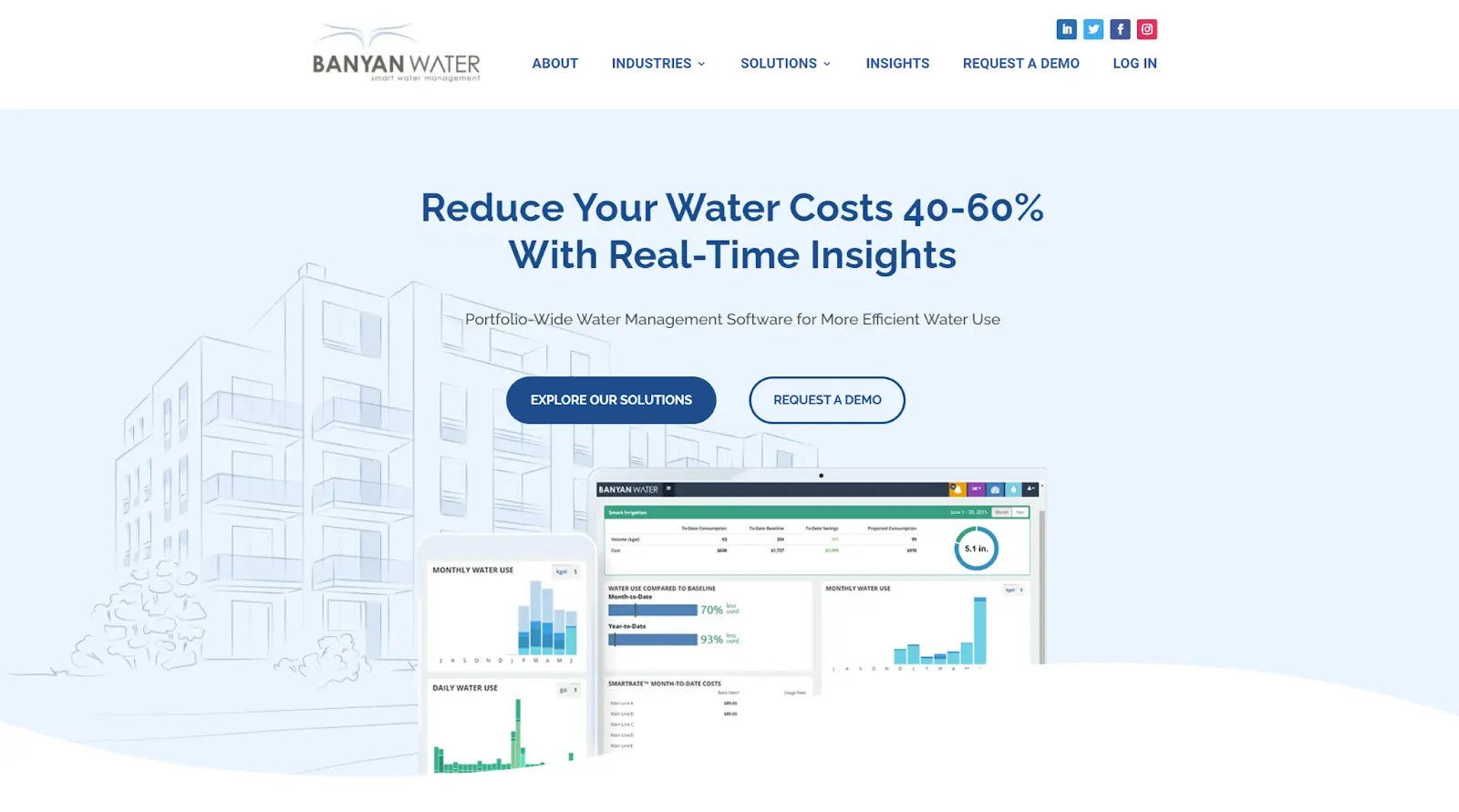
Example: For client Banyan Water we designed a hero section with the clear and measurable benefit of working with Banyan. It offers appeal, clarity, and proof, capturing the visitor’s attention right away.
Good Navigation
The right information in the right place says your brand is expert and trustworthy. The more seamless the user experience (UX), the more you position yourself as a knowledgeable partner who cares about your customers.
We find that the combination of easy navigation, great information in digestible sections, and strategically placed calls-to-action (CTAs) increases conversions.
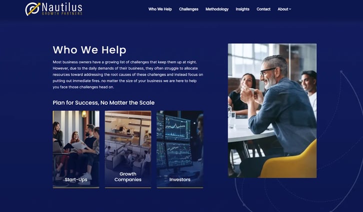
Example: Nautilus Growth grouped their content to clearly present who their clients are and what specific challenges the company helps them solve.
Digestible sections
Use clear headings, key points, simple statements, bullet points, and pull quotes. As you provide more layers of information, break it down to smaller sections that readers can navigate into if they want to. (It helps to have a great copy team who can provide clean, accurate, economical text to work with.)
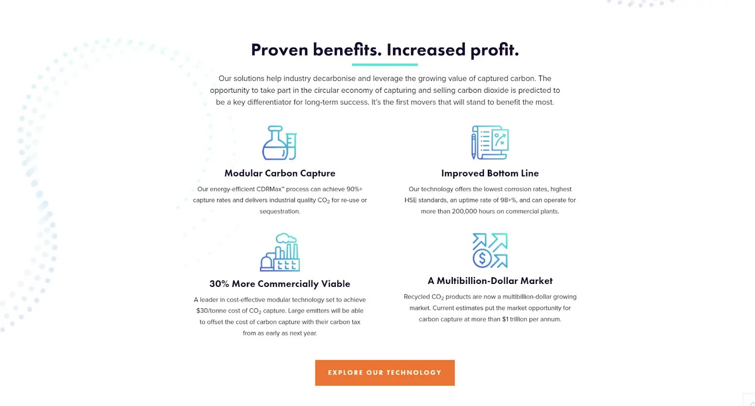
Example: For client Carbon Clean, we presented their unique benefits as a group of four simple sections, placed midway down the page. One thing to note: this isn’t copy lite. There’s solid but distilled information.
Purposeful call-to-actions
Strong calls to action (CTAs) on your home page will guide potential customers to taking desired actions. They should be strategically placed, visually prominent, and bear a specific message encouraging users to engage further.
The text on the CTA button itself shouldn’t be generic (avoid “Submit” and “Send”). Emphasize the value someone will get from clicking it.
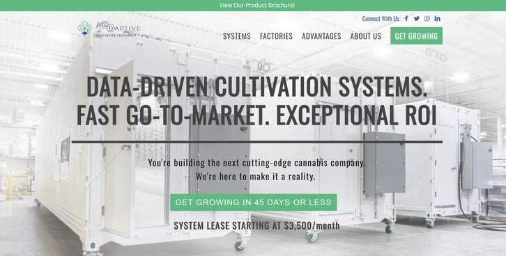
Example: Agdaptive clearly sets expectations with two cleverly worded, well-placed CTAs on their homepage:
3. Keep load times fast
It’s tempting to want to impress visitors with a feature-rich home page. But from my experience, that’s something to avoid.
Elements like slideshows rely on JavaScript, which can slow down page loading and doesn’t work on all devices and browsers. So that carousel of images may actually frustrate your users instead of inspire them to want to learn more. Better to focus on using a lightweight, responsive design for a universally seamless experience.
Example: Asana opens their homepage with a simple layout that offers a clear message and doesn’t waste anyone’s time.
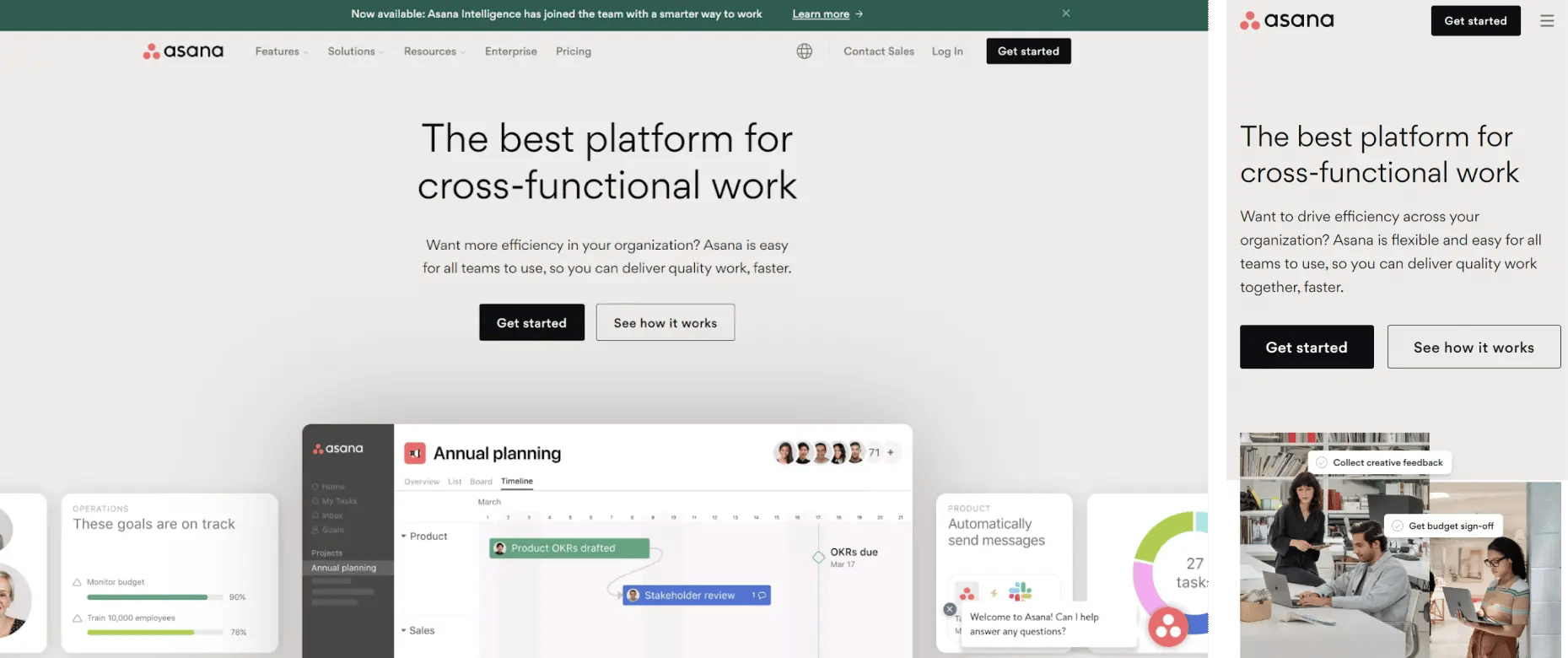
4. Prioritize mobile users
If you notice, I included Asana’s mobile page above as well — and it’s just as clean and fast to load. These days, having a mobile-friendly, responsive site is a must: it’s highly likely visitors are going to access a home page via a mobile device, or go back and forth as they spend more time on your site.
When designing your home page, prioritize the mobile user experience. Again, use lightweight and responsive design elements that work across devices, optimizing content layout for smaller screens.
Example: Tungco offers a home page that gives both desktop and mobile users the same clean, consistent look that’s easy to navigate.
5. Use images to boost your message
Visual content is a powerful tool for communicating complex concepts and demonstrating your products and services. People remember 80% of the content they take in visually versus 20% of what they read. Strengthen your message with images and illustrations. Not only will they deepen understanding of what your company offers, they raise the quality of your home page’s overall design.
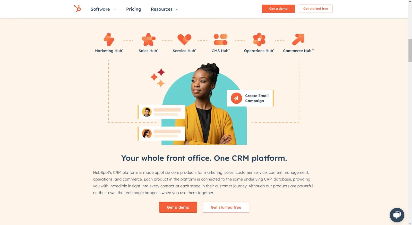
Example: HubSpot uses beautifully designed images and custom branded iconography to communicate their platform’s features.
6. Use animations sparingly and with purpose
While animations are fun, they can be distracting. Use them sparingly to create delight and interest, but don’t overwhelm visitors or take away from your main message. We often use subtle animations (like over states) that draw attention to specific areas of a home page, and interactive elements that engage users without being overly disruptive.
Example: For our client Facility Ally, we used dynamic hover states for their key industries, enhancing the home page experience.
7. Add social proof whenever you can
We know social proof influences purchasing decisions in the B2B space, and we recommend using it on home pages. Incorporate testimonials, case studies, and success stories from satisfied clients. External validation and real-life examples of your solutions at work always add credibility to your brand and inspire a sense of trust.
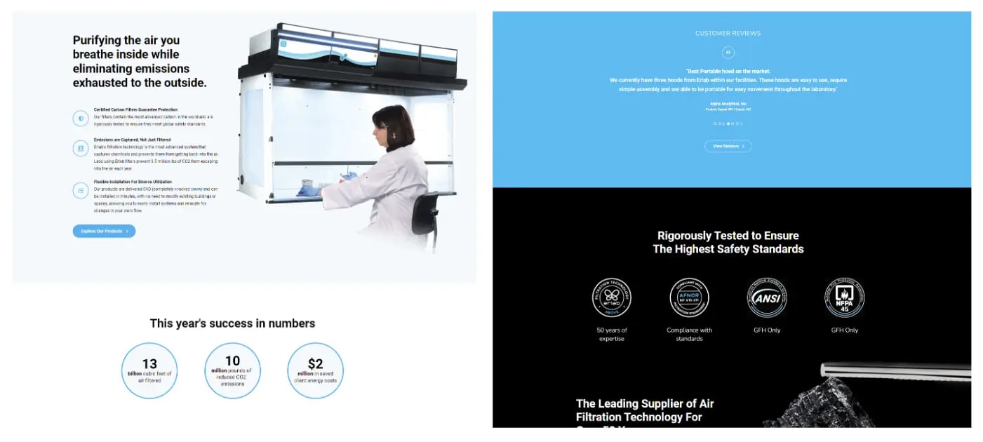
Example: Our client Erlab USA showcases a variety of social proof on their homepage. From Success metrics, to client testimonials and trust seals there are multiple visual indicators to help build trust with their audience.
8. Promote your website’s top-performing content
Last but definitely not least, once you have web site content that’s performing beautifully, highlight it on the home page. A blog post, an industry report, an informative video, a webcast — whatever it is, featuring it on your home page will drive traffic, engage visitors, and often keep their attention longer.
You also bolster your own credibility and demonstrate you care about your audience by showing them something relevant and valuable. It’s about them, after all.
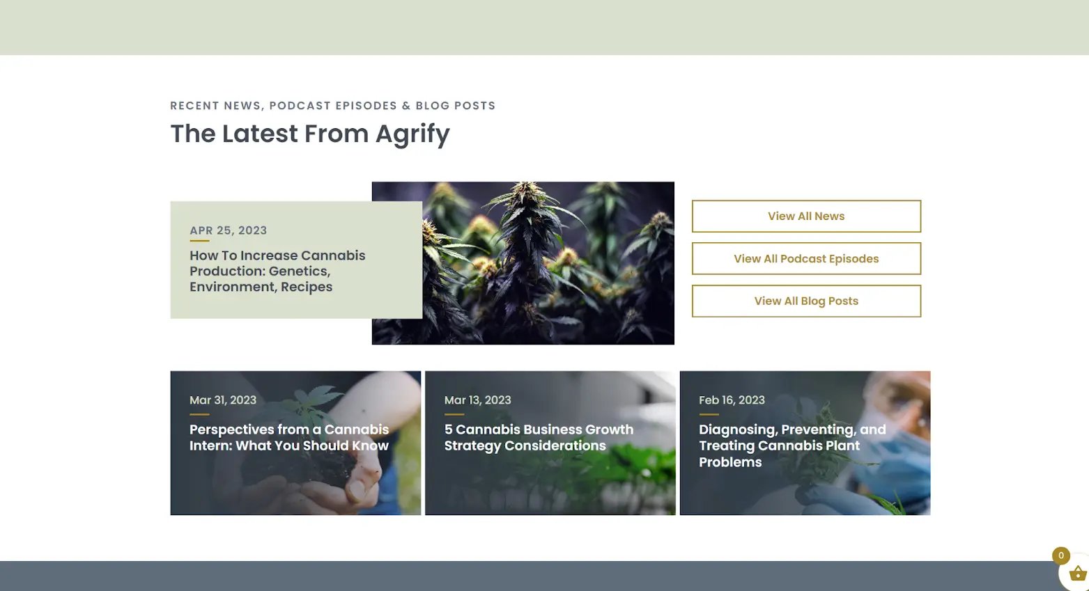
Example: For our client Agrify, we build a section on the home page that features some of their most relevant resources:
Optimize, test, and re-optimize
The process of building out a great home page is always rewarding, from better aligning to our client’s needs to driving measurable results in terms of target audience and demand generation. But once you optimize your home page by making it attractive, user-friendly and persuasive, you’re not done.
B2B tech is a dynamic field and you need to stay dynamic with your content and presence as well. Make sure to continuously test and optimize your home page based on user feedback and industry best practices. That’s the most effective way to continually support your marketing goals.
Seek a partner and an expert’s eye
We understanding how busy running a B2B tech company can be — leaving limited time and bandwidth for critical marketing strategies. We function as an active partner for our clients, enabling you to focus on growing your business while we work on getting the most out of your digital presence.
We’d be happy to work with you on optimizing your home page, your website, and more. Reach out to one of our experts.

Resources