The HubSpot CRM platform lets you see all of your data in one place, making it easy to get a complete picture of business performance on the fly. It also allows you to easily integrate some of your favorite apps without any of the headaches of plugin management to measure, monitor, and report on all of your most essential data right within HubSpot.
This guide will show you how to collate, analyze and interpret complex data sets to maximize growth, and drive more revenue across your business by creating insightful HubSpot reports and dashboards.
Storytelling with data
Data tells a story. But it’s all in how you present it, and just tossing a slew of graphs onto a dashboard won’t necessarily make a good story. You need to provide context as well as the reason you’re sharing the data in the first place. Share information on why certain results occurred. Show whether the data reveals a positive or negative trend. Don’t leave it up to the viewer to interpret. They may not. And they’re depending on you to tell a meaningful story.
Laying out the data right is key. You want the information you’ve gathered to be doing the work, providing actionable insights, and meaningfully driving your business forward. And make sure the data and the story line up. It’s not enough to craft a narrative that may suit your objective but isn’t supported by the data you’re showing.
Planning Your Dashboards
Know why you’re creating your dashboard: 3 questions to ask
How do you figure out what dashboards to build? Ask yourself three key questions to find out — and have a better idea of not only who’s looking at your dashboard, but how in-depth you need to go with tracking.
- What problem does this dashboard need to solve?
Most teams have some understanding of their purpose and overall objectives. Make sure your dashboard aligns with them. If you just force a dashboard that doesn’t have a clear purpose, you’re wasting time, resources and other people’s attention and time.
- What metrics are most important to the target group?
Choosing the right metrics to identify, measure and improve depends on many factors. Consider the type of offering or product ,the business model (e.g.: B2C or B2B), the industry (e.g.: e-commerce or SaaS), the job function (e.g.: product, or marketing, or sales), and more. Then choose the five to ten most important metrics and use dashboards to show each one. By doing so you’ll see what kind of value you’re adding — or not — and help tell the real story to stakeholders.
- Who are you solving it for?
Clients and stakeholders come in many shapes and sizes. Depending on their department and their role, they’ll likely want to see different metrics. Define your target for each dashboard, so you:
– create the right board for the right people.
– understand how to communicate and act on the right data.
– increase the likelihood that the dashboard will be well-received.
Then write down the clarity viewers should walk away with after looking at the board. Great metrics lead to great insights, and that leads to actions and results.
Dashboard Design and Layout Best Practices
There are very simple rules to follow when designing your dashboards, but they have a big payoff. Your main objective is to make sure the viewer remembers the essential details. That means putting it in the right place — so they can’t miss it.
Remember: Top left
Place your most important metrics in the top left hand. Structure your content to read from left to right — that’s one of the best ways to make sure it’s understood.

Group specific data within dashboard components
There is nothing worse than going to a dashboard and seeing information scattered everywhere. When you’re creating your data dashboard, focus on specific topics and groups. Organizing data clearly is essential. Your viewers need to know what they’re seeing, be able to see it as part of the bigger picture, and use it as they need it.
Give your numbers context
Your viewers aren’t going to necessarily know if a certain data point is good or bad. You need to provide context to frame the numbers so they mean something. For instance, they might not know that 32 leads in a given day is an increase unless you indicate it.

How? One of the easiest ways to do this is to include past data for comparison, or show progress:
- Include the same metric for the previous day or even a line or column chart showing how the metric tracks over a longer period.
- Or, include the average or previous highs and lows.
- Or, if you’re working towards a goal, include both the target and your current progress.
- You can also add warnings for when a metric is above or below a certain threshold to make it easier to spot problems.
Use text blocks to communicate cause and effect
Another important thing to note is that all of your business data is related and changing. One thing in your business may affect multiple data points across many of your dashboards.
One of the hardest things to do is spot and understand how one data point or set of data points correlates to another. Therefore, we also recommend adding text blocks within your data to help identify different sections and even give your notes on how the data correlates. Doing so will make it much easier for your audience to understand what the data tells you.
Remember to set the correct date range
One of the easiest ways to have your data “lie” is to have incorrect, inaccurate, or inconsistent date ranges.
If you’re preparing several pieces of data for presentation, each piece likely needs to be set to the same date range to avoid confusion or false assumptions.
Sometimes having different date ranges is necessary. But, in most cases, it’s critical to clearly outline the different date ranges and why they are different. The last thing you want is the person that prepared the data to misinterpret it because they don’t realize that the date ranges are not the same.
Presenting your dashboards
It’s important to account for how you’ll share your dashboards with a client. This can change how you structure the dashboard and what information you spell out clearly.
If you’re presenting the data in person, you can leave out some text blocks and explain the data within your presentation. However, it’s more likely that you’ll be sending the dashboard to your audience, and they’ll view the data on their own.
If this is the case, give as much detail and explanation as possible. You don’t want your audience to misinterpret a data point in the dashboard — it could result in poor business decisions and mistakes.
Layout: How You Distribute Content on the Page

Break up the text into short paragraphs and bulleted points so that it’s easy to skim (no “wall of words” to discourage your readers).
Keep the layout simple and uncluttered, with plenty of margin and white space (blank areas that give the eyes a chance to rest).
Left justify the text to make it easier to read. Readers sometimes overlook titles that are centered.
Font Size and Type
Make the text large enough for easy reading and choose highly readable fonts. Serif fonts have little strokes at the ends of letters; sans serif fonts do not.
For Web reports, experts usually recommend using a sans serif font for easy on-screen reading.
For printed reports, experts tend to recommend using a serif font for the main text and a sans serif font for headings, subheadings, and labels. Choose serif and sans serif fonts that are both easy to read and contrast well with each other.
Use boldface type to highlight important words and phrases. But use it sparingly, because large blocks of text in bold are hard to read.
Font Color and Contrast
Maintain high contrast between the text and background. Black text on a white or very light background is the most readable text.
Be cautious with colored text. Never put text in light colors such as orange or yellow against a light background.
Minimize use of “reversed-out” text (light text on a dark background), which is hard to read, especially in printed material. Also, if users will be printing the report themselves, reversed-out text requires too much ink, making printing costly.
Avoid printing text on colored backgrounds unless the background is very light (such as pale yellow). Shading the background reduces contrast and makes the text harder to read. For ease of reading, do not put text on top of photos or patterned backgrounds.
Make It Easy To Navigate the Report and Pick Up the Main Points
To guide people smoothly through your report, use text and graphics in combination to give clear, consistent navigation signals.
These signals help people notice what’s in the report and help them find the parts of personal interest without distracting or misleading them.
Use plenty of informative headings and subheadings. Make them pop out for easy skimming by creating a strong contrast between the text and the headings and leaving enough space around the headings.
Be consistent
Consistent design helps orient people, facilitates skimming, and enables easy navigation through the report.
Keep the overall page layout and design features consistent
Although each page in your report may have different content, the basic design should be consistent. Keep the formatting of titles, headings, bulleted lists, labels, and other text the same throughout the report (same font, size, color, and so on).
Provide persistent navigation links for the main headings and keep them in the same position on each page.
Keep improving your HubSpot dashboards
Our final piece of dashboard design advice is the most important. Once you’ve built your HubSpot dashboard, don’t just leave it. Instead, ask your team for feedback.
- What do they look at most often or find most useful, and why?
- What do they never look at or find least useful, and why?
- Is there anything missing that they’d find helpful?
- Has it changed anything about the way they work?
Use this feedback to iterate your dashboard. Check your dashboard is driving the behavior you intended. Step back from your board now and then and look at how all the elements work together. Remind yourself what information you’re primarily trying to get across and how effectively those important elements stand out.
As your goals and priorities change, make sure you update your HubSpot dashboard so it acts as the heartbeat for whatever you’re doing.
Using HubSpot Reports
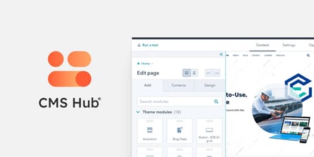
One of the advantages of the HubSpot CRM platform is the powerful reports that come standard with each tool. Tools like Sequences in Sales Hub, Social or Traffic Analytics in Marketing Hub, Knowledge Base in Service Hub and Website Pages in CMS Hub all have their reports covering those specific tools.
Here are the reporting tools available in HubSpot and how you can use them:
In-Tool Reports
Tools like Ads, Social Media, Sequences, Workflows, Knowledge Base all have reporting dashboards or analyze tabs available. These tabs offer insights on common metrics associated with these tools such as impressions, open-rates, conversions, etc.
These dashboards show the most common reports that anybody using these tools are likely to ask about the performance of the particular tool and actions you’re taking. While simple, these reports are powerful in helping determine which assets are performing and driving both traffic and conversions.
HubSpot Analytics Tools
A powerful set of standard tools that show the analytics on sources of traffic, contacts and customers, lifecycle stage reports and more. These reports allow you to track the sales or service activity, understand which campaigns drive results, and track the changes in your recurring revenue.
These standard reports come standard within the relevant HubSpot packages/hubs as indicated below:
- Traffic Analytics (Marketing Hub Professional, Enterprise, CMS Hub Professional, Enterprise)
- Sales Analytics (Sales Hub Professional, Enterprise)
- Custom Behavioral Events (Marketing Hub Enterprise)
- Contact Analytics (Marketing Hub Professional, Enterprise)
- Campaign Analytics (Marketing Hub Professional, Enterprise)
- Sales Content Analytics (Sales Hub Professional, Enterprise)
- Form Analytics (Marketing Hub Professional, Enterprise, CMS Hub Professional, Enterprise)
- Revenue Analytics (Sales Hub Enterprise)
Custom Reports: Single Object
Analyze contacts, companies, deals, tickets, custom objects, activities, line items, or feedback submissions.
Custom Reports Builder
An advanced report builder that enables you to analyze objects concerning marketing, sales, and service activities.
Funnel Reports
Measure the conversion rates between certain stages in a customer’s lifecycle or deal’s pipeline. If you have an Enterprise subscription, you can also create a custom events funnel.
Contact attribution report
Measure which sources, assets, and interactions impacted lead generation (Marketing Hub and CMS Hub Enterprise only).
Deal create attribution reports
Measure which sources, assets, and interactions impacted deal generation (Marketing Hub Enterprise only).
Revenue attribution reports
Measure which sources, assets, and interactions had the greatest impact on revenue (Marketing Hub Enterprise only).
Building Custom HubSpot Reports
Custom HubSpot report enables you to dive into the details. For instance, you can further analyze the data at hand or review it in-depth, compare activities, and more with a custom report.
Therefore, with custom reporting, you can analyze various objects and integrations in one place. This means you can have all your data sources at one spot rather than having to join data in Excel from scratch for building a report on another software.
To get started with creating a HubSpot custom report, you need to have four things in place:
- Your data set – this includes contacts, products, companies, activities, etc.
- Properties – these are the properties of your data set objects.
- Filters – you can set filters to get more specific. For example, you can filter contacts by their city.
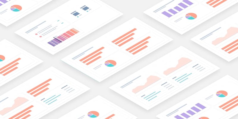
- Visualization – this is how you will display your data, in an area graph, pie chart or table among many other options.
Once you’re done making your HubSpot custom report, you can name and save it to your reports lists or dashboard. You can also export it to save it on your device.
For help building custom reports, use this guide from HubSpot.
5 Questions for Deciding Which Chart Type to Use When Creating Reports
1. Do you want to compare values?
Charts are perfect for comparing one or many value sets, and they can easily show the low and high values in the data sets.
To show comparison:
- Column
- Mekko
- Bar
- Pie
- Line
- Scatter Plot
- Bullet

2. Do you want to show the composition of something?
Use this type of chart to show how individual parts make up the whole of something, such as the device type used for mobile visitors to your website or total sales broken down by sales rep.
To show composition:
- Pie
- Stacked Bar
- Mekko
- Stacked Column
- Area
- Waterfall

3. Do you want to understand the distribution of your data?
Distribution charts help you to understand outliers, the normal tendency, and the range of information in your values.
To show distribution:
- Scatter Plot
- Mekko
- Line
- Column
- Bar

4. Are you interested in analyzing trends in your data set?
If you want to know more about how a data set performed during a specific period, specific chart types do extremely well.
To show trends:
- Line
- Dual-Axis Line
- Column

5. Do you want to better understand the relationship between value sets?
Relationship charts are suited to showing how one variable relates to one or numerous different variables. You could use this to show how something positively affects, has no effect, or negatively affects another variable.
To show relationships:
- Scatter Plot
- Bubble
- Line
10 Best Tips For Building HubSpot Reports
Here are some of our best tips for building HubSpot reports:
- Balance text with visuals to make your information easy to digest.
- Use a single highlight color to draw attention to key information.
- Create a clear text hierarchy to make your report easy to navigate.
- Incorporate your branding for a cohesive report design.
- Visualize your data with bar charts, line charts, bubble charts, and pie charts.
- Use a 2-column layout for optimal readability.
- Leave plenty of whitespace in your report design.
- Apply consistent motifs across every page of your report design.
- Use color blocks to group related information.
- Include an appendix with detailed tables and graphs.
Create insightful HubSpot reports and dashboards for your B2B company
Looking for help building insightful reports in HubSpot? Contact New Perspective’s team and we can assist you in building dashboards and insightful reports to help track your campaign conversions.